In September, we talked about adding guest interviews,
character interviews, and book blurbs and/or excerpts to newsletters. Today, we’re
going to talk about creating a header for your front page.

I suppose it’s not very professional of me, but for some
reason I’ve never quite been able to wrap my head around Adobe Photoshop. I can’t
quite get the layers to work. I use Microsoft Publisher and Irfanview (which is
free) to create the MFRW Newsletter. I start with blank pages in letter size,
8-1/2 X 11, Portrait. The first thing you need to do is create headings for
your pages. Well, okay, I suppose you need to figure out how many pages you’re
going to use and what kind. Then you can determine what sort of headings you’ll
need. On the first page, I suggest using your banner if you have one. Open it
in Irfanview or whatever program you use that allows you to resize photos. Resize
it so the width is 8.5 inches with the aspect ratio kept intact. I find 150
dots-per-inch (dpi) is about perfect. It creates a nice, sharp image without
taking up too much bandwidth. Save as in your newsletter artwork folder. I have
a subfolder for permanent artwork and one for each issue.
If you do not have a banner, now is a good time to create
one, and you can do so in Publisher. Besides, you’ll want to add a few things
to your banner to create your header.

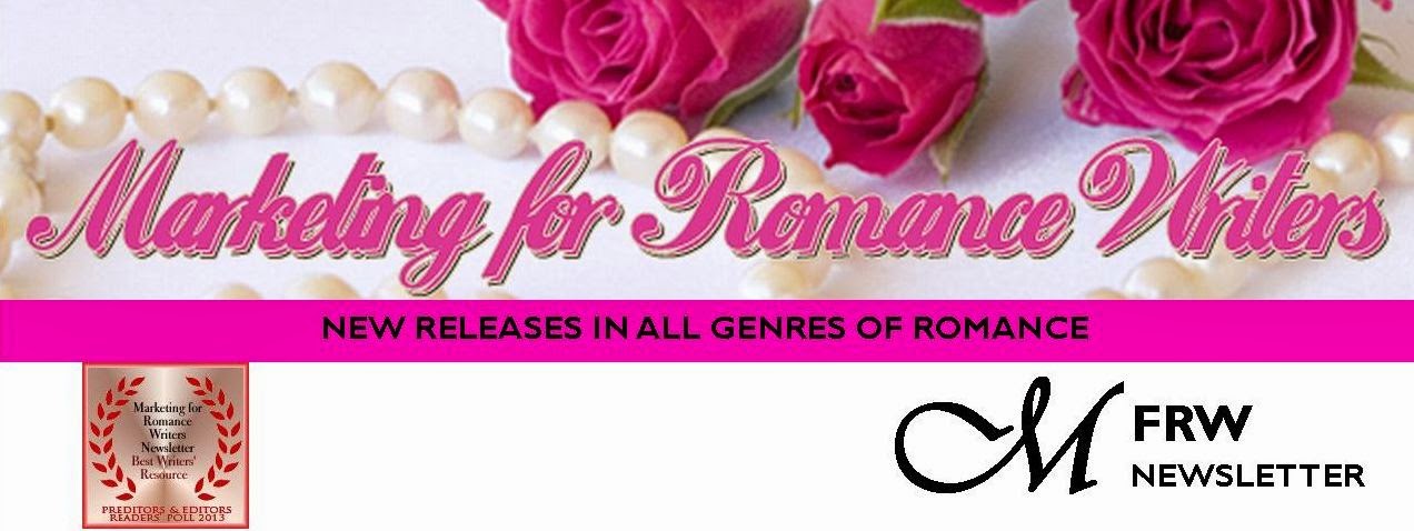
The MFRW first-page header consists of our banner—roses and
pearls with our name across the top. Directly beneath and abutting our banner
is a solid pink bar that states our purpose: NEW RELEASES IN GENRES OF ROMANCE.
I used Gill Sans MT 14 Point Bold for the font in that bar. Then we have
another inch or so of white space with our newsletter logo. The M is in Vivaldi
72 Point Bold in its own text box, and the FRW is Gill Sans MT 22 Bold. The
word Newsletter is Gill Sans MT 14 Bold. Since we won the Preditors & Editors
award, I’ve added that to our header, as well. I saved it both as a pub file
and a jpg file. Then, I opened the jpg file and cropped it just below the
bottom of the lowest bit of text in the newsletter logo. Even though the sizing
says it’s 8.5 inches wide, I usually have to stretch it across the page to make
it fit.

Next, I open another blank page. I click on Insert Photo and
insert my new header. In the white space of the header, I draw a small text
box, about two inches wide. I decide what color and type fonts I plan to use. In
there, I put the month and year of the current issue, as well as the Volume and
Issue numbers (if you care to keep track of those). Actually, for the template,
I put in three asterisks where the month should be, then a comma, and then the
year. I add the Volume number and put another asterisk where the Issue number
should go. Next, I delete the jpg of the header so all I have on the page is
the date-box template and I save that.
Each month I insert the header jpg, open my pub file, copy
and paste the date box, and it should go right in where it belongs. All I have
to do replace the asterisks with the month and Issue number, and my first page
header is complete.
Rochelle Weber is
a Navy veteran and holds a BA in Communications from Columbia College in
Chicago with an emphasis on Creative Writing. “Would you like fries with that?”
Her novels Rock Bound and Rock Crazy are available in both e-book
and print. She edits for Jupiter Gardens Press, and is the Editor-in-Chief of
the Marketing for Romance Writers Newsletter, winner of the 2013 Preditors
& Editors Readers’ Poll for Best Writers’ Resource.
 Rochelle battles bi-polar disorder, quipping, “You haven’t
lived until you’ve been the only woman on the locked ward at the VA.” Her song,
“It’s Not My Fault,” won a gold medal in the National Veterans Creative Arts
Competition. She lives in Round Lake Beach, Illinois. She has two married daughters,
four grandchildren, three step-grandkids, and one step-great-grandkid. Two cats
allow her to live with them and cater to their every whim.
You can access the MFRW
Newsletters at:
Or:
http://issuu.com/mfrw/docs


.jpg)


