Showing posts with label IrfanView. Show all posts

Saturday, February 7, 2015

Creating a Newsletter--The Body by Rochelle Weber, Publisher #MFRW Newsletter


Last month, we discussed creating the first page of a newsletter. For some authors, that’s all you’ll need. Others may go further. You may want to add another page with a blurb and an excerpt of the book your guest author’s promoting. And, of course, you’ll want to include buy-links for the book. I don’t think I mentioned this before, but I always work with both rulers visible. I use them as guides when placing text boxes and artwork.

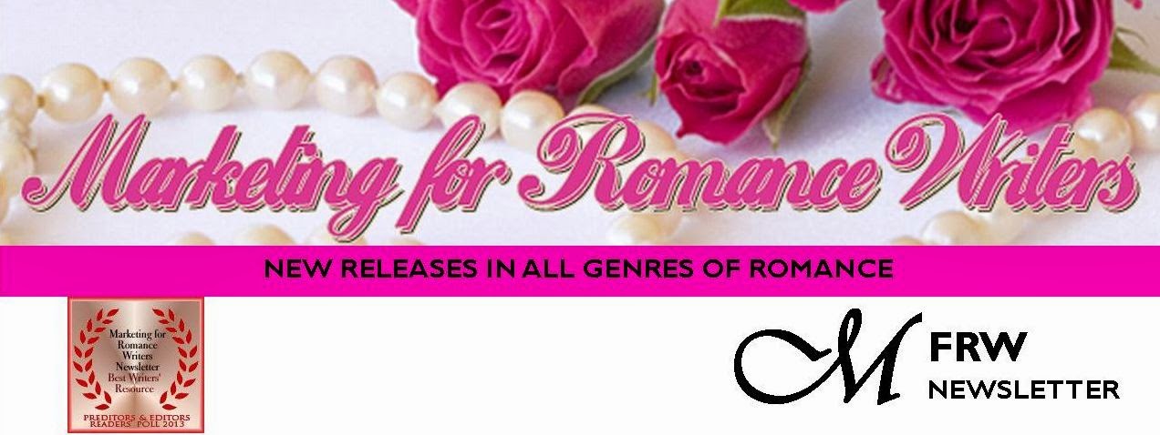
In the MFRW Newsletter, we have headers at the top of each page. You can use your banner. All of ours have our logo, and since we showcase numerous books in various genres, we have banners for each genre, as well as some that just have our logo. Once you’ve designed a basic banner, it’s easy to adapt it if you wish to do so. Maybe you’ll just want to use a slightly shorter version of the header you created for your first page. All you need to do is go into IrfanView (or whatever photo editing software you’re using), pull up the jpg of your header, and resize it.


To resize artwork in IrfanView, click on the Image menu, and then Resize/Resample. You’ll see “Change Size Here and Width and Height boxes. Choose “pixels, cm, or inches”—whichever you’re most comfortable working with. Be sure to click “Preserve aspect ratio (proportional).” I also like to click “Apply sharpen after resample.” Then adjust your height. I suggest using headers that are no more than 1.5 inches tall. You may have to stretch it out a bit to fit it across your page. If that’s the case and the text and artwork appear stretched, you’ll want to go back to IrfanView (or whatever photo editing software you’re using) and shorten your artwork a bit more (maybe down to one inch) so you can catch it at the corner and stretch it out symmetrically. I prefer 150 dots per inch (dpi). It’s dense enough to post on the web, but doesn’t take up as much bandwidth as 300 dpi.


Next, I add a box for the page title. That can be the title of the book, the author’s name with (Cont.) or (Cont. from Page 1), etc. I use a short box, about a half inch tall, as wide as the page, or at least from margin to margin. I use a font like Arial Rounded MT Bold in about 18 points in this box. For MFRW, we use pink text in this box, but you can play with your text. On the left side of the screen, there’s usually a toolbar with an icon that shows a skewed capital A. If you click on that, it will give you a bunch of special text formats to choose from. Or, you can highlight the text and click on the icon in the Home ribbon that shows a capital A underlined in red. You can go in there to change the color of your font. If you click on “more colors,” you’ll get a palette of colors, and you can also click on the Custom tab at the top to tweak the colors to your own taste. I keep a list of the color formulae for the header/URL Link/box line pink; the rusty/brown for the in-text titles, and the gold for the artwork frames.

Once I have the artwork prepared, I create text boxes for the writing. I do my writing in Word and then I can just transfer it to the text boxes in Publisher. My preferred font for text is Garamond 11, and I use the ruler in Word to set up my indentations. I inherited a Mensa newsletter that used Garamond 11 and I liked it, so it’s become my standard.


After I’ve transferred the material to Publisher, I hit Control/A to highlight everything in the text box. Then I go to the Format menu and click on Paragraph. In that menu box, I can set my justification (usually justified), set the spacing I want above and below each paragraph and between lines. I use 1.15 spaces between lines. It gives just a smidge extra space there. You want to put a lot of information into a small space with a newsletter, so you probably don’t want to go with double spacing or even 1.5 lines’ spacing. I suggest spacing your lines no larger than 1.25 lines.


Finally, place your cursor where you want your artwork to go, and go to Insert Artwork from My Computer. There’s an icon for it that has what looks like a photo of a mountain on it, but I’m not sure if that’s a regular part of the toolbar, or if I added it when I customized the Publisher toolbar to suit my needs.

That, I think, takes care of the body, unless you want to add a Masthead. We can discuss that next month.


Rochelle Weber is a Navy veteran and holds a BA in Communications from Columbia College in Chicago with an emphasis on Creative Writing. “Would you like fries with that?” Her novels Rock Bound and Rock Crazy are available in both e-book and print. Her third novel, The Thin Person Inside, will be available in multiple digital formats from MuseItUp Publishing, Inc., in May, 2015. She edits for Jupiter Gardens Press, and is the Publisher of the Marketing for Romance Writers Newsletter, winner of the 2013 Preditors & Editors Readers’ Poll for Best Writers’ Resource.

Rochelle battles bi-polar disorder, quipping, “You haven’t lived until you’ve been the only woman on the locked ward at the VA.” Her song, “It’s Not My Fault,” won a gold medal in the National Veterans Creative Arts Competition. She lives in Round Lake Beach, Illinois. She has two married daughters, four grandchildren, three step-grandkids, and one step-great-grandkid. Two cats allow her to live with them and cater to their every whim.

You can access the MFRW Newsletters at:


Or:

Thursday, January 8, 2015

Creating a Newsletter—The First Page by Rochelle Weber, Newsletter Editor #MFRWorg


In November, we covered creating a header for the first page of a newsletter. Since the MFRW Newsletter broke ninety pages, we’ve discussed the difference between a newsletter and a magazine.  One of our members posted an article that discussed the differences.  Length was one.  Most newsletters run between one and twenty-four pages.  I guess we passed that a few years ago.  Another major difference was the cover.  Most magazines have a photo on the cover with a headline and teasers about the content inside, which usually consists of articles and advertising in non-industry-specific language.  Newsletters tend to have articles on the front.  Of course, I like to add some sort of artwork to the front of my newsletters as well.  It would be a pretty dull publication without some sort of illustration.


So, how do I lay it out?  I add text boxes for the articles I put on the front page.  In the case of the MFRW Newsletter, we put our Featured Author on the front page.    We start with the person’s biography one the left and an interview on the right.  We put the author’s photo in the top right-hand corner, and if there’s room we put his/her contact info in a box at the bottom left.  Again, I use IrfanView to size it.  I like 1.5 inches wide, and I keep the aspect even and let IrfanView decide the length.  We outline the Contacts box in pink.  Our headings are in brown and the links are in hot pink.  The text box for the biography takes up about one-third (1/3) of the width of the page.

As for the interview, the submission form contains several questions for each author to choose from—some serious ones about the craft of writing, some funny ones that may give us an insight into the author him/herself.  And it just occurred to me that since we’re a marketing group, I should probably ask about their favorite marketing technique. I’d better add that to the form as soon as I finish this so I don’t forget!

Depending on how well that fits in the remaining two-thirds (2/3) of the page, it can be one wide column or two narrow ones.  I’ve found that when info doesn’t fit in one column, it sometimes will fit in two. To create columns in Publisher, click on the Columns Icon next to the Paragraph Icon (¶) just to the right of center on the top toolbar.  It should give you a drop-down icon that allows you to choose the number of columns you want by highlighting the columns in the icon.  You’ll then have two columns that are exactly the same size.  To increase the size between columns, go to Format, Text Box, click on the button in the lower right-hand corner that says Columns, and where it says “Spacing,” change that number.  I like 0.25 best.  If I figure out a way to make that the default, I’ll let you know.


Now, all you need to do is figure out what you want to put on your front page!

And, going back to the difference between a newsletter and a magazine, I’d love to add more articles to the MFRW Newsletter.  It’s definitely big enough to be a magazine.  Just think, me, a magazine E-I-C.…  I still wouldn’t get any money for it, but it’d look good in my bio!  Wouldn’t you folks like to be the Cover Models for a magazine?

Rochelle Weber is a Navy veteran and holds a BA in Communications from Columbia College in Chicago with an emphasis on Creative Writing. “Would you like fries with that?” Her novels Rock Bound and Rock Crazy are available in both e-book and print. She edits for Jupiter Gardens Press, and is the Editor-in-Chief of the Marketing for Romance Writers Newsletter, winner of the 2013 Preditors & Editors Readers’ Poll for Best Writers’ Resource.

Rochelle battles bi-polar disorder, quipping, “You haven’t lived until you’ve been the only woman on the locked ward at the VA.” Her song, “It’s Not My Fault,” won a gold medal in the National Veterans Creative Arts Competition. She lives in Round Lake Beach, Illinois. She has two married daughters, four grandchildren, three step-grandkids, and one step-great-grandkid. Two cats allow her to live with them and cater to their every whim.

You can access the MFRW Newsletters at:


Or:

Friday, November 7, 2014

Newsletters: Creating a First Page Header by Rochelle Weber, Newsletter Editor #MFRWorg

In September, we talked about adding guest interviews, character interviews, and book blurbs and/or excerpts to newsletters. Today, we’re going to talk about creating a header for your front page.


I suppose it’s not very professional of me, but for some reason I’ve never quite been able to wrap my head around Adobe Photoshop. I can’t quite get the layers to work. I use Microsoft Publisher and Irfanview (which is free) to create the MFRW Newsletter. I start with blank pages in letter size, 8-1/2 X 11, Portrait. The first thing you need to do is create headings for your pages. Well, okay, I suppose you need to figure out how many pages you’re going to use and what kind. Then you can determine what sort of headings you’ll need. On the first page, I suggest using your banner if you have one. Open it in Irfanview or whatever program you use that allows you to resize photos. Resize it so the width is 8.5 inches with the aspect ratio kept intact. I find 150 dots-per-inch (dpi) is about perfect. It creates a nice, sharp image without taking up too much bandwidth. Save as in your newsletter artwork folder. I have a subfolder for permanent artwork and one for each issue.

If you do not have a banner, now is a good time to create one, and you can do so in Publisher. Besides, you’ll want to add a few things to your banner to create your header.


The MFRW first-page header consists of our banner—roses and pearls with our name across the top. Directly beneath and abutting our banner is a solid pink bar that states our purpose: NEW RELEASES IN GENRES OF ROMANCE. I used Gill Sans MT 14 Point Bold for the font in that bar. Then we have another inch or so of white space with our newsletter logo. The M is in Vivaldi 72 Point Bold in its own text box, and the FRW is Gill Sans MT 22 Bold. The word Newsletter is Gill Sans MT 14 Bold. Since we won the Preditors & Editors award, I’ve added that to our header, as well. I saved it both as a pub file and a jpg file. Then, I opened the jpg file and cropped it just below the bottom of the lowest bit of text in the newsletter logo. Even though the sizing says it’s 8.5 inches wide, I usually have to stretch it across the page to make it fit.


Next, I open another blank page. I click on Insert Photo and insert my new header. In the white space of the header, I draw a small text box, about two inches wide. I decide what color and type fonts I plan to use. In there, I put the month and year of the current issue, as well as the Volume and Issue numbers (if you care to keep track of those). Actually, for the template, I put in three asterisks where the month should be, then a comma, and then the year. I add the Volume number and put another asterisk where the Issue number should go. Next, I delete the jpg of the header so all I have on the page is the date-box template and I save that.

Each month I insert the header jpg, open my pub file, copy and paste the date box, and it should go right in where it belongs. All I have to do replace the asterisks with the month and Issue number, and my first page header is complete.

Rochelle Weber is a Navy veteran and holds a BA in Communications from Columbia College in Chicago with an emphasis on Creative Writing. “Would you like fries with that?” Her novels Rock Bound and Rock Crazy are available in both e-book and print. She edits for Jupiter Gardens Press, and is the Editor-in-Chief of the Marketing for Romance Writers Newsletter, winner of the 2013 Preditors & Editors Readers’ Poll for Best Writers’ Resource.

Rochelle battles bi-polar disorder, quipping, “You haven’t lived until you’ve been the only woman on the locked ward at the VA.” Her song, “It’s Not My Fault,” won a gold medal in the National Veterans Creative Arts Competition. She lives in Round Lake Beach, Illinois. She has two married daughters, four grandchildren, three step-grandkids, and one step-great-grandkid. Two cats allow her to live with them and cater to their every whim.


You can access the MFRW Newsletters at:


Or:

http://issuu.com/mfrw/docs