Showing posts with label Preditors & Editors Readers' Poll Awards. Show all posts

Thursday, January 8, 2015

Creating a Newsletter—The First Page by Rochelle Weber, Newsletter Editor #MFRWorg


In November, we covered creating a header for the first page of a newsletter. Since the MFRW Newsletter broke ninety pages, we’ve discussed the difference between a newsletter and a magazine.  One of our members posted an article that discussed the differences.  Length was one.  Most newsletters run between one and twenty-four pages.  I guess we passed that a few years ago.  Another major difference was the cover.  Most magazines have a photo on the cover with a headline and teasers about the content inside, which usually consists of articles and advertising in non-industry-specific language.  Newsletters tend to have articles on the front.  Of course, I like to add some sort of artwork to the front of my newsletters as well.  It would be a pretty dull publication without some sort of illustration.


So, how do I lay it out?  I add text boxes for the articles I put on the front page.  In the case of the MFRW Newsletter, we put our Featured Author on the front page.    We start with the person’s biography one the left and an interview on the right.  We put the author’s photo in the top right-hand corner, and if there’s room we put his/her contact info in a box at the bottom left.  Again, I use IrfanView to size it.  I like 1.5 inches wide, and I keep the aspect even and let IrfanView decide the length.  We outline the Contacts box in pink.  Our headings are in brown and the links are in hot pink.  The text box for the biography takes up about one-third (1/3) of the width of the page.

As for the interview, the submission form contains several questions for each author to choose from—some serious ones about the craft of writing, some funny ones that may give us an insight into the author him/herself.  And it just occurred to me that since we’re a marketing group, I should probably ask about their favorite marketing technique. I’d better add that to the form as soon as I finish this so I don’t forget!

Depending on how well that fits in the remaining two-thirds (2/3) of the page, it can be one wide column or two narrow ones.  I’ve found that when info doesn’t fit in one column, it sometimes will fit in two. To create columns in Publisher, click on the Columns Icon next to the Paragraph Icon (¶) just to the right of center on the top toolbar.  It should give you a drop-down icon that allows you to choose the number of columns you want by highlighting the columns in the icon.  You’ll then have two columns that are exactly the same size.  To increase the size between columns, go to Format, Text Box, click on the button in the lower right-hand corner that says Columns, and where it says “Spacing,” change that number.  I like 0.25 best.  If I figure out a way to make that the default, I’ll let you know.


Now, all you need to do is figure out what you want to put on your front page!

And, going back to the difference between a newsletter and a magazine, I’d love to add more articles to the MFRW Newsletter.  It’s definitely big enough to be a magazine.  Just think, me, a magazine E-I-C.…  I still wouldn’t get any money for it, but it’d look good in my bio!  Wouldn’t you folks like to be the Cover Models for a magazine?

Rochelle Weber is a Navy veteran and holds a BA in Communications from Columbia College in Chicago with an emphasis on Creative Writing. “Would you like fries with that?” Her novels Rock Bound and Rock Crazy are available in both e-book and print. She edits for Jupiter Gardens Press, and is the Editor-in-Chief of the Marketing for Romance Writers Newsletter, winner of the 2013 Preditors & Editors Readers’ Poll for Best Writers’ Resource.

Rochelle battles bi-polar disorder, quipping, “You haven’t lived until you’ve been the only woman on the locked ward at the VA.” Her song, “It’s Not My Fault,” won a gold medal in the National Veterans Creative Arts Competition. She lives in Round Lake Beach, Illinois. She has two married daughters, four grandchildren, three step-grandkids, and one step-great-grandkid. Two cats allow her to live with them and cater to their every whim.

You can access the MFRW Newsletters at:


Or:

Friday, November 7, 2014

Newsletters: Creating a First Page Header by Rochelle Weber, Newsletter Editor #MFRWorg

In September, we talked about adding guest interviews, character interviews, and book blurbs and/or excerpts to newsletters. Today, we’re going to talk about creating a header for your front page.


I suppose it’s not very professional of me, but for some reason I’ve never quite been able to wrap my head around Adobe Photoshop. I can’t quite get the layers to work. I use Microsoft Publisher and Irfanview (which is free) to create the MFRW Newsletter. I start with blank pages in letter size, 8-1/2 X 11, Portrait. The first thing you need to do is create headings for your pages. Well, okay, I suppose you need to figure out how many pages you’re going to use and what kind. Then you can determine what sort of headings you’ll need. On the first page, I suggest using your banner if you have one. Open it in Irfanview or whatever program you use that allows you to resize photos. Resize it so the width is 8.5 inches with the aspect ratio kept intact. I find 150 dots-per-inch (dpi) is about perfect. It creates a nice, sharp image without taking up too much bandwidth. Save as in your newsletter artwork folder. I have a subfolder for permanent artwork and one for each issue.

If you do not have a banner, now is a good time to create one, and you can do so in Publisher. Besides, you’ll want to add a few things to your banner to create your header.


The MFRW first-page header consists of our banner—roses and pearls with our name across the top. Directly beneath and abutting our banner is a solid pink bar that states our purpose: NEW RELEASES IN GENRES OF ROMANCE. I used Gill Sans MT 14 Point Bold for the font in that bar. Then we have another inch or so of white space with our newsletter logo. The M is in Vivaldi 72 Point Bold in its own text box, and the FRW is Gill Sans MT 22 Bold. The word Newsletter is Gill Sans MT 14 Bold. Since we won the Preditors & Editors award, I’ve added that to our header, as well. I saved it both as a pub file and a jpg file. Then, I opened the jpg file and cropped it just below the bottom of the lowest bit of text in the newsletter logo. Even though the sizing says it’s 8.5 inches wide, I usually have to stretch it across the page to make it fit.


Next, I open another blank page. I click on Insert Photo and insert my new header. In the white space of the header, I draw a small text box, about two inches wide. I decide what color and type fonts I plan to use. In there, I put the month and year of the current issue, as well as the Volume and Issue numbers (if you care to keep track of those). Actually, for the template, I put in three asterisks where the month should be, then a comma, and then the year. I add the Volume number and put another asterisk where the Issue number should go. Next, I delete the jpg of the header so all I have on the page is the date-box template and I save that.

Each month I insert the header jpg, open my pub file, copy and paste the date box, and it should go right in where it belongs. All I have to do replace the asterisks with the month and Issue number, and my first page header is complete.

Rochelle Weber is a Navy veteran and holds a BA in Communications from Columbia College in Chicago with an emphasis on Creative Writing. “Would you like fries with that?” Her novels Rock Bound and Rock Crazy are available in both e-book and print. She edits for Jupiter Gardens Press, and is the Editor-in-Chief of the Marketing for Romance Writers Newsletter, winner of the 2013 Preditors & Editors Readers’ Poll for Best Writers’ Resource.

Rochelle battles bi-polar disorder, quipping, “You haven’t lived until you’ve been the only woman on the locked ward at the VA.” Her song, “It’s Not My Fault,” won a gold medal in the National Veterans Creative Arts Competition. She lives in Round Lake Beach, Illinois. She has two married daughters, four grandchildren, three step-grandkids, and one step-great-grandkid. Two cats allow her to live with them and cater to their every whim.


You can access the MFRW Newsletters at:


Or:

http://issuu.com/mfrw/docs

Thursday, August 7, 2014

Preparing Artwork for Newsletters (Or Blogs)


How do you put together an award-winning newsletter?  Well, you could use Word and just write a lot, but that would be kind of boring.  What sets one newsletter apart from another is the use of artwork.  There are a lot of different programs out there that enable you to edit artwork.  I like IrfanView.  It’s free, and I find it easier than the Microsoft or Adobe programs.  Microsoft wants to store everything in the Cloud and I don’t necessarily want to store other people’s book covers in my Picasa account.  As for Adobe, I seem to have a mind-block when it comes to that program.  Don’t know why.

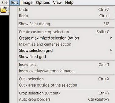
So, when I receive a photo, I save it to a folder I keep for my newsletter artwork.  If the author doesn’t send artwork, I go to her/his publisher’s website or to Amazon and copy it from there.  If I get it from Amazon, I’ll need to crop the Amazon info from the artwork.  To do that, I open the file in IrfanView.  I then click on the magnifying glass icon with the + sign until the image is large enough to work with.  Place the cursor at your favorite corner of the book, and outline the book.  Then go to edit and scroll down to “Crop selection,” and click.  If you’ve done it right, you should have just the artwork without the Amazon logo.

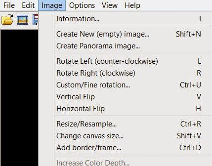
I like to keep all of my artwork at a uniform size.  I think 1.5 inches wide works best.  Book covers are usually about 1.5” wide by about 2.25” long.  Author photos tend to be more square.  And I think 150 dots per inch works fairly well.  So, go to Image, which is the drop-down menu right next to Edit.  Click on Resize/Resample.  You’ll see the boxes where you can set the sizes for width and height.  Make sure you click on inches or pixels—whichever you’re most comfortable with.  I usually make sure the “Preserve Aspect Ratio” and “Apply Sharpen After Resample” boxes are also checked.  Finally, I set the DPI (Dots per Inch) box at 150 or 300, depending on how dense you want your artwork to be, and how large you want your file to be.  The MFRW Newsletter is up to almost eight pages and will soon be over a hundred, so 150 DPI are plenty for us.


Save your artwork in its folder, and you’re good to go!

Now I’d like to introduce you to Emerald.  When our staff splits and we have an editorial section and an Advertising Section, Em will head the editorial side.
 

Emerald is an erotic fiction author and general advocate for human sexuality as informed by her deep appreciation of the beauty, value, and intrinsic nature of sexuality and its holistic relation to life. Her work has been featured in anthologies published by Cleis Press, Mischief, and Logical-Lust, and she serves as an assistant newsletter editor and Facebook group moderator for Marketing for Romance Writers (MFRW). Read more about her at her website, The Green Light District.