Showing posts with label Newsletters. Show all posts

Saturday, October 3, 2015

Should Authors Blog? Why? @kayelleallen #writingtips #MFRWorg

Button for Kayelle Allen's blog 
Recently on the Marketing for Romance Writers (MFRW) Yahoo Group, someone asked "What am I missing?" The topic was about blogging. She wanted to know what was in it for her as a writer. Wasn't it a better use of her time to be writing books? If blogging didn't do any good, why should she spend time doing it? It's a fair question, and one many authors have had.

As a writer who's been published for eleven years (with fifteen books including two anthologies and one boxed set), I've had a bit of experience in the area. I'm also the founder of MFRW. People share their stories with me. Here's my take on blogging.

A blog is a way of having fresh content on your website every day. How often can you release a new book? Probably not often enough to get people to come back to your website on a regular basis. Blogging brings people, and can generate followers for your blog, and for your social media.

Ask yourself -- so what? 

Why does that matter? Because those people who come back are people who have heard of you. When people buy books, they buy books that interest them, and they buy books by authors they know. They've learned that the author will give them a good read. Name recognition in this business is a major key to success.

When readers see your name, if they've been to your blog and/or followed you on social media, there is name recognition. That's crucial, epecially when thousands of books are released every day. If you have a choice between buying a book by someone you've never heard of, and someone you know, which will you pick?

As much as we'd all like to say that we write for the joy of writing and because it's in us and we just have to write, the truth is, we'd like to make some money doing it. We'd like to have a best seller.

Blogging is part of the overall marketing strategy a writer needs. Do you have to write in-depth articles every day? Certainly not. You can have guests, post videos about cats, have a puzzle spot, do a post with pictures of your vacation, anything you want. It doesn't have to be every day. But you need fresh content to keep readers coming back. Experiment with it. Is it three times a week? Once a week? Twice a month? Be consistent, and talk about things you love. Do what works for you.

The other -- and to me, this is the number one reason for blogging -- is to get people to sign up for your newsletter. If you don't have one, start it now. I use Mailchimp. There are other programs. Find what works for you, and use it at least once a month. Why? I'm glad you asked.

If you are consistently sending readers to Amazon, or Barnes and Noble, or ARe, or any book seller, that's great. It's nice when they buy. But wouldn't it be great if you knew who those people were? Wouldn't it be awesome if when your next book comes out you could send them a direct email and let them know personally? They already bought your other book. Why wouldn't they want your next one? Of course they would. But if you only send readers to the book sellers, you will never know who those readers are. So create a sign up sheet via MailChimp (or another site) and invite people to give you their email address. You won't get a ton of sign ups, but you will get some. It takes time, but build up your list. Have a contest now and then. You don't have to spend a ton of money on this. But get started now.
Create a simple graphic 

Create a Graphic

An easy way to get people to sign up is to write a short story based on characters in a current book, and offer that as a giveaway for signing up. They sign up, and MailChimp sends the confirmation, with a link to your book's download site. Easy peasy. Create a graphic that invites people to sign up for your newsletter, and place it on your blog and website. Link it to your sign up page. Want to see one in action? Try mine.

All you need to get people to come to your site on a regular basis is a reason for them to be there. That is where blogging comes in.

Remember, the number one reason to have a website is to sell books. You do that by having fresh content, a way for people to sign up for your newsletter, and information on the site about those books. It's simply another way to connect with readers.

Yes, it takes time and organization to set up. Once you get over the fact that you will have to work at being an author, just like any other job, you'll do well. It wasn't easy to write the book. It wasn't easy to publish it. Blogging is just one more step in the process of making people aware of you, your talent, and your stories.

But hey, you got this far, didn't you? You got this.
---
Kayelle Allen is a best selling author, and the Founder, Marketing for Romance Writers.
Website http://kayelleallen.com/ Twitter http://twitter.com/kayelleallen

Friday, November 7, 2014

Newsletters: Creating a First Page Header by Rochelle Weber, Newsletter Editor #MFRWorg

In September, we talked about adding guest interviews, character interviews, and book blurbs and/or excerpts to newsletters. Today, we’re going to talk about creating a header for your front page.


I suppose it’s not very professional of me, but for some reason I’ve never quite been able to wrap my head around Adobe Photoshop. I can’t quite get the layers to work. I use Microsoft Publisher and Irfanview (which is free) to create the MFRW Newsletter. I start with blank pages in letter size, 8-1/2 X 11, Portrait. The first thing you need to do is create headings for your pages. Well, okay, I suppose you need to figure out how many pages you’re going to use and what kind. Then you can determine what sort of headings you’ll need. On the first page, I suggest using your banner if you have one. Open it in Irfanview or whatever program you use that allows you to resize photos. Resize it so the width is 8.5 inches with the aspect ratio kept intact. I find 150 dots-per-inch (dpi) is about perfect. It creates a nice, sharp image without taking up too much bandwidth. Save as in your newsletter artwork folder. I have a subfolder for permanent artwork and one for each issue.

If you do not have a banner, now is a good time to create one, and you can do so in Publisher. Besides, you’ll want to add a few things to your banner to create your header.


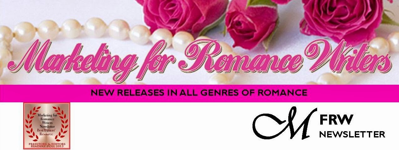
The MFRW first-page header consists of our banner—roses and pearls with our name across the top. Directly beneath and abutting our banner is a solid pink bar that states our purpose: NEW RELEASES IN GENRES OF ROMANCE. I used Gill Sans MT 14 Point Bold for the font in that bar. Then we have another inch or so of white space with our newsletter logo. The M is in Vivaldi 72 Point Bold in its own text box, and the FRW is Gill Sans MT 22 Bold. The word Newsletter is Gill Sans MT 14 Bold. Since we won the Preditors & Editors award, I’ve added that to our header, as well. I saved it both as a pub file and a jpg file. Then, I opened the jpg file and cropped it just below the bottom of the lowest bit of text in the newsletter logo. Even though the sizing says it’s 8.5 inches wide, I usually have to stretch it across the page to make it fit.


Next, I open another blank page. I click on Insert Photo and insert my new header. In the white space of the header, I draw a small text box, about two inches wide. I decide what color and type fonts I plan to use. In there, I put the month and year of the current issue, as well as the Volume and Issue numbers (if you care to keep track of those). Actually, for the template, I put in three asterisks where the month should be, then a comma, and then the year. I add the Volume number and put another asterisk where the Issue number should go. Next, I delete the jpg of the header so all I have on the page is the date-box template and I save that.

Each month I insert the header jpg, open my pub file, copy and paste the date box, and it should go right in where it belongs. All I have to do replace the asterisks with the month and Issue number, and my first page header is complete.

Rochelle Weber is a Navy veteran and holds a BA in Communications from Columbia College in Chicago with an emphasis on Creative Writing. “Would you like fries with that?” Her novels Rock Bound and Rock Crazy are available in both e-book and print. She edits for Jupiter Gardens Press, and is the Editor-in-Chief of the Marketing for Romance Writers Newsletter, winner of the 2013 Preditors & Editors Readers’ Poll for Best Writers’ Resource.

Rochelle battles bi-polar disorder, quipping, “You haven’t lived until you’ve been the only woman on the locked ward at the VA.” Her song, “It’s Not My Fault,” won a gold medal in the National Veterans Creative Arts Competition. She lives in Round Lake Beach, Illinois. She has two married daughters, four grandchildren, three step-grandkids, and one step-great-grandkid. Two cats allow her to live with them and cater to their every whim.


You can access the MFRW Newsletters at:


Or:

http://issuu.com/mfrw/docs

Sunday, September 7, 2014

Interviews for Newsletters

Back again.  This month I’m talking about how to do interviews for your newsletters.  Interviewing an author for your newsletter is basically the same as doing so for a blog.  However, if you’re printing your newsletters and mailing them out or if you want to keep them to a format that looks like a page, you have space issues that differ from those involved in posting a blog.

As far as the questions go, they’re pretty much the same.  “How did you start writing?”  “What inspires you?”  “What is your ‘process’?”  And the fun ones—“Long, hot, sudsy bath or steamy shower?”  “Steak or lobster?”  “Chocolate or Cheesecake?”  “If you were stranded on a desert island…”

Or, you can interview a character.  “Why do you think someone would write a story about you?”  “Tell me about your hero. How did you meet him?”  “Why don’t you think your relationship with him will work?”

What other material do you plan to use?  A blurb from your guest's book?  An excerpt?  Buy links?  Contact info? It helps to figure out in advance how much space you have in your newsletter and how much space you can give to each item.  Back in the days of electric typewriters, one page of pica type double-spaced equaled three-hundred words.  Using Garamond 11 point type, justified with 1.15 line spacing, I can fit about 200 words in a text box that measures 5.5 inches wide by 4 inches tall.

How long your interviews, blurbs, or excerpts run will depend on whether you want to start them on one page and finish on another.  If you do so, don’t forget to add (To be continued) at the bottom of the first page, and (Continued from Page *) at the beginning of the piece when you pick it up on another page.  I suggest you present intros to both your guest and a taste of what you’re doing on you’re doing on your front page, and then get to the meat of your interview, blurb, excerpt, etc., on the inside.

 
It helps to set up a template to work from and a submission page you can send to your guests so you don’t have to type the same thing over and over.  You could maybe come up with twenty questions and ask them to chose five to answer, and then provide space for their blurb and excerpt, letting them know the word count you can accommodate.

 
In journalism, there are two major principles:  the six Ws—Who, What, Where, When, Why and How, and the Inverted Pyramid.  Always give the meat of the story first, and then go into details later.  The smaller the detail, the farther down the page it belongs.  That’s why journalists fight for headlines and stories on Page 1 “above the fold.”  The six Ws are in a specific order, which should not be tampered with.  People want to know who did what to whom.  Next they want to know where and then when. They’re less interested in why or how.  That info can go on page three below the fold.


Now, I’d like you to meet my next Assistant Editor, Barbara Donlon Bradley.


Writing for Barbara Donlon Bradley started innocently enough. Like most she kept diaries, journals, and wrote an occasional letter, but she also had a vivid imagination and wrote scenes and short stories adding characters to her favorite shows and comic books. As time went on she found the passion for writing to be a strong drive for her. Humor is also very strong in her life. No matter how hard she tries to write something deep and dark, it will never happen. That humor bleeds into her writing. Since she can’t beat it she has learned to use it to her advantage. Now she lives in Tidewater Virginia with two cats, one mother in law—she’s 85 now—her husband, and teenage son.

Thursday, August 7, 2014

Preparing Artwork for Newsletters (Or Blogs)


How do you put together an award-winning newsletter?  Well, you could use Word and just write a lot, but that would be kind of boring.  What sets one newsletter apart from another is the use of artwork.  There are a lot of different programs out there that enable you to edit artwork.  I like IrfanView.  It’s free, and I find it easier than the Microsoft or Adobe programs.  Microsoft wants to store everything in the Cloud and I don’t necessarily want to store other people’s book covers in my Picasa account.  As for Adobe, I seem to have a mind-block when it comes to that program.  Don’t know why.

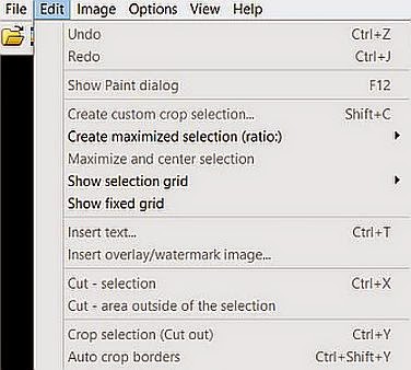
So, when I receive a photo, I save it to a folder I keep for my newsletter artwork.  If the author doesn’t send artwork, I go to her/his publisher’s website or to Amazon and copy it from there.  If I get it from Amazon, I’ll need to crop the Amazon info from the artwork.  To do that, I open the file in IrfanView.  I then click on the magnifying glass icon with the + sign until the image is large enough to work with.  Place the cursor at your favorite corner of the book, and outline the book.  Then go to edit and scroll down to “Crop selection,” and click.  If you’ve done it right, you should have just the artwork without the Amazon logo.

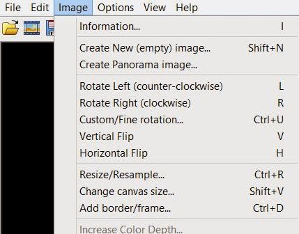
I like to keep all of my artwork at a uniform size.  I think 1.5 inches wide works best.  Book covers are usually about 1.5” wide by about 2.25” long.  Author photos tend to be more square.  And I think 150 dots per inch works fairly well.  So, go to Image, which is the drop-down menu right next to Edit.  Click on Resize/Resample.  You’ll see the boxes where you can set the sizes for width and height.  Make sure you click on inches or pixels—whichever you’re most comfortable with.  I usually make sure the “Preserve Aspect Ratio” and “Apply Sharpen After Resample” boxes are also checked.  Finally, I set the DPI (Dots per Inch) box at 150 or 300, depending on how dense you want your artwork to be, and how large you want your file to be.  The MFRW Newsletter is up to almost eight pages and will soon be over a hundred, so 150 DPI are plenty for us.


Save your artwork in its folder, and you’re good to go!

Now I’d like to introduce you to Emerald.  When our staff splits and we have an editorial section and an Advertising Section, Em will head the editorial side.
 

Emerald is an erotic fiction author and general advocate for human sexuality as informed by her deep appreciation of the beauty, value, and intrinsic nature of sexuality and its holistic relation to life. Her work has been featured in anthologies published by Cleis Press, Mischief, and Logical-Lust, and she serves as an assistant newsletter editor and Facebook group moderator for Marketing for Romance Writers (MFRW). Read more about her at her website, The Green Light District.